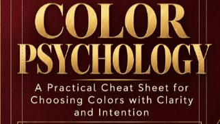
Color Psychology
Color Psychology for Digital Products and Marketing A Practical Cheat Sheet for Choosing Colors With Clarity and Intention
RESOURCE TYPE: Quick Reference
Ever picked a color just because it looked nice — then wondered why your page still didn't feel "right"?
Color isn't decoration. It's one of the fastest signals a customer reads before they ever read your words — shaping whether your brand feels trustworthy or forgettable, premium or cheap, calm or chaotic, in the half-second before someone decides to keep scrolling or stop.
This cheat sheet gives you what most beginners never get: a fast, referenceable system for choosing colors on purpose — for your logo, your Canva templates, your sales pages, your social graphics — without needing a design degree or hours of second-guessing.
Inside, you'll find:
What each color actually communicates — and where it can work against you
How to build a working 5-role brand palette (not just "pick pretty colors")
The 60-30-10 rule for balancing color across any design
A color-by-marketing-goal guide (build trust, create urgency, feel premium, and more)
Accessibility and conversion checks so your designs work for every reader
A 6-step Quick Selection Process you can run every time
Common color mistakes to avoid
Includes 2 files: the Color Psychology Cheat Sheet ebook + a separate, larger Color Reference Chart for easy reference while you design.
Keep it open while you build. Pull it up before every new product, post, or page.
A great palette gets someone to stop scrolling. A great brand gives them a reason to stay.
Price: $7.99
Legacy Branches Co. — Wisdom That Outlives Us