
TL;DR: 80% of Creators don’t make a single sale. And most of the time, the problem isn’t the product—it’s the sales page. A great sales page builds trust, addresses hesitations, and makes your offer’s value crystal clear. This blueprint breaks down seven proven strategies to help you turn browsers into buyers.
80% of Creators who sell digital products don’t make a single sale. Crazy, right? But it makes sense—especially with how many people are making content these days.
Think about it: how many times have you clicked on a product link, felt curious, but bounced because the page didn’t convince you? That’s the gap we’re closing here.
To make a sale, you’ve got to capture your audience’s attention, show them what makes your offer valuable, and convince them why they should buy from you over another Creator.
That’s why your sales page matters so much. It’s not just about having a good product—it’s about making buyers feel confident enough to actually complete a purchase.
I’m Lauren, Stan’s Creator Marketing Manager and fellow Creator 👋 I’ve spent my career helping people like you turn their viewers into customers, ultimately monetizing your content, so you can ditch the work you hate and do more of what you love.
And after years of helping Creators go from just starting to six figures, I’ve learned a thing or two about building a sales page that actually sells.
That’s why I’m pouring everything I know into this guide, breaking down:
✨ Why most sales pages flop
✨ What buyers really look for before purchasing
✨ Simple changes that can make your page stand out and convert
So you can avoid mistakes and maximize sales from the start. Welcome to your complete sales page blueprint—the step-by-step system used by conversion experts to turn visitors into customers.
Let’s dive in.
First, What’s a Sales Page?
A sales page is what your customer sees before purchasing your product. It’s your moment to win them over—they’ve already taken the action of visiting your product, now you just need to close the deal.
A great sales page will make visitors feel seen and heard rather than sold to, leaving them excited and eager to purchase your product based on the value you’ve outlined that they’ll gain.
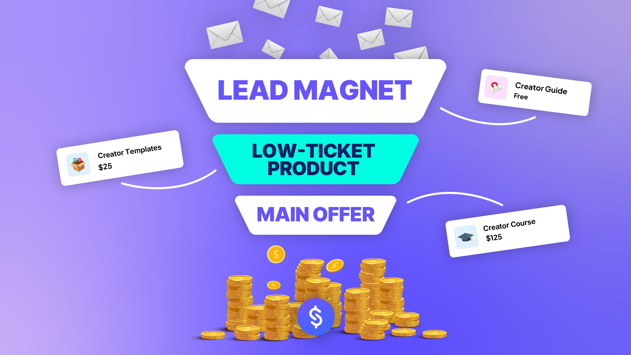
Sales pages can have different goals! For example you can:
- Sell paid offers, like digital products, online courses, or coaching calls
- Drive sign-ups for freebies, like a lead magnet or free webinar
- Encourage your audience to join your community or membership
Why Your Sales Page Matters
⭐️ Your content is what sparks curiosity—but your sales page is what closes the deal.
Think of your sales page as your own 24/7 digital salesperson: ready to answer questions, build trust, and guide someone from “This looks interesting” to “I’m ready to buy.”
When you understand the psychology behind why people buy, you can craft a sales page that not only informs, but persuades.
If done right, your sales page will:
- Remove hesitations
- Build confidence
- Get your audience to buy
This blueprint breaks down the essential elements of a high-converting sales page and shows you exactly how to bring them to life.
7 Ways to Make Your Sales Page Stand Out and Convert
1. Remove Hesitation by Answering Questions
Every buyer comes to your page with questions in mind. And if you don’t answer them quickly, potential customers won’t just hesitate—they’ll exit the page altogether.
Give them what they want by:
- Leading with clear, key information about your offer, like the price, what it includes, and how to buy
- Adding a short FAQ section that addresses common doubts (How fast will I see results? Do I need prior experience?)
- Being upfront about what the product is—and isn’t. Transparency builds trust
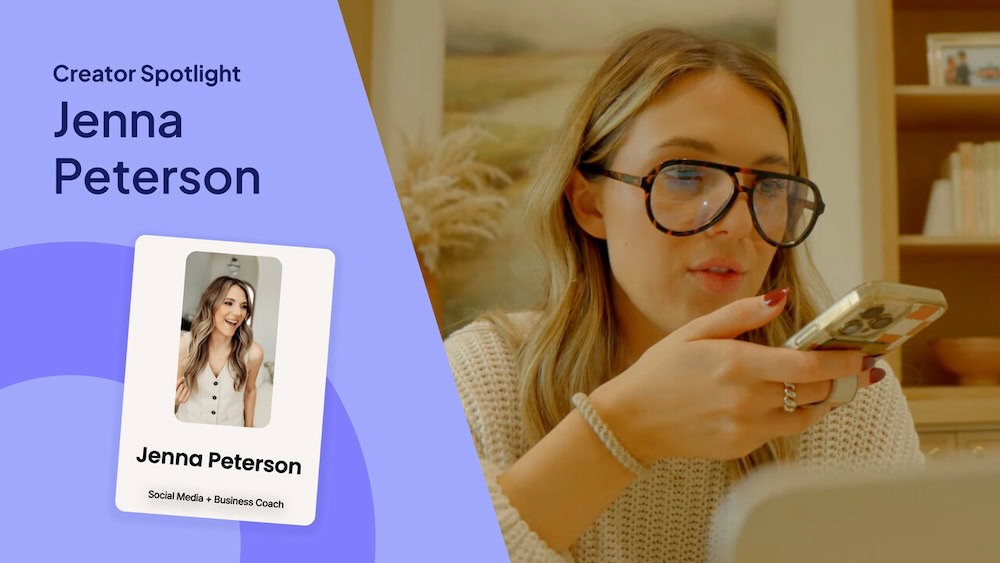
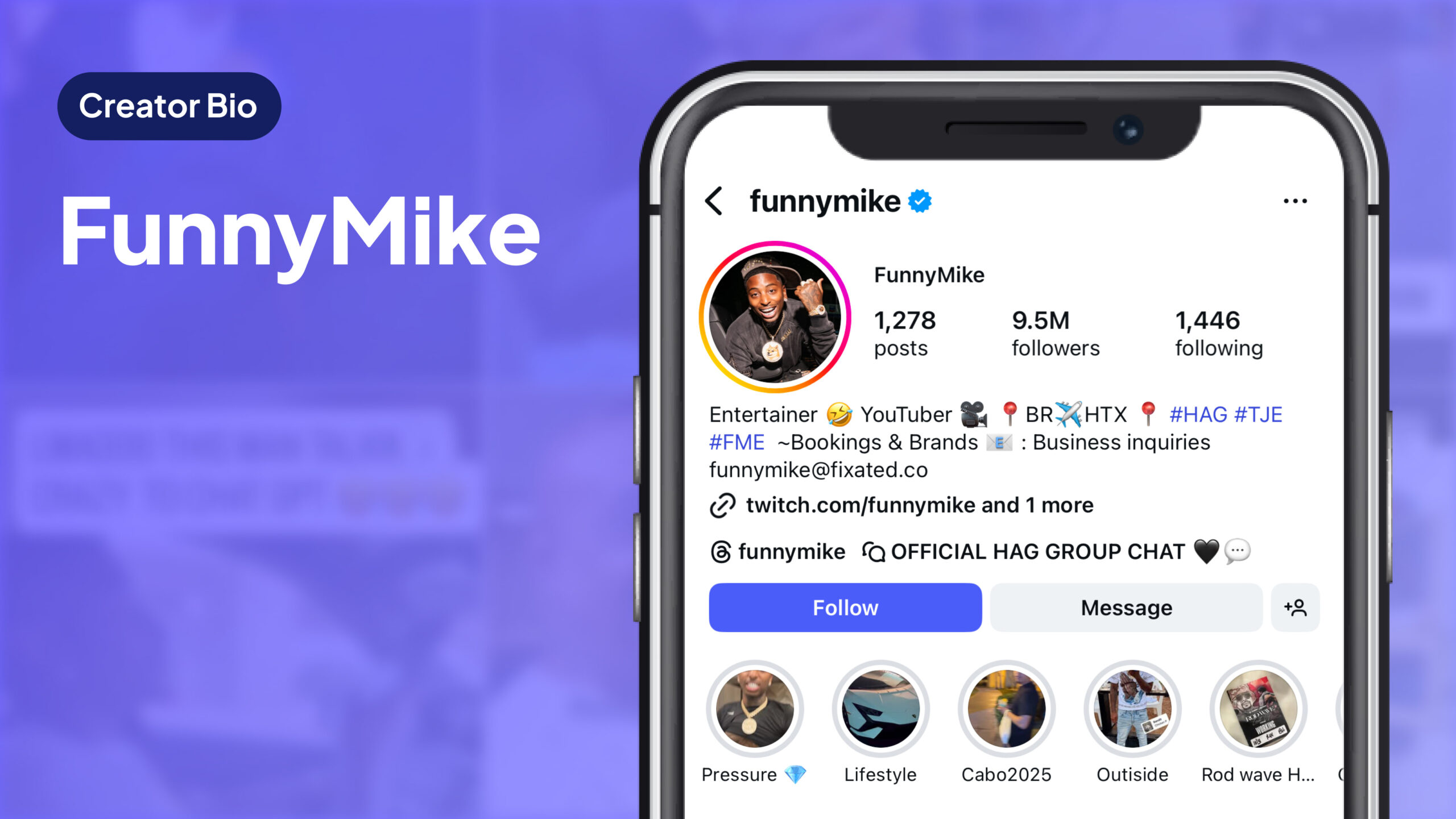
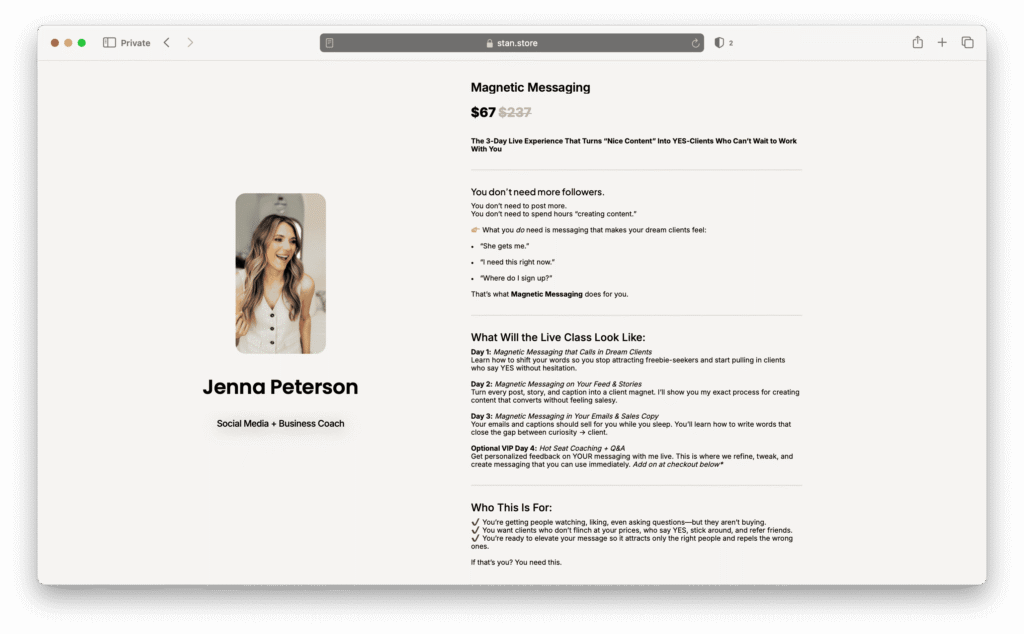
Jenna Peterson’s sales page is a great example. She instantly breaks down what her offer includes, its structure, and who it’s for.
2. Use Discounts to Spark Action
Humans are wired to respond to deals. In fact, 70% of customers admit that juicy discounts have pushed them to make an unplanned purchase.
Why? Because a discount creates urgency and helps people feel they’re gaining more value than they’re giving up, incentivizing them to buy. It’s the same sales psychology that immediately makes you more drawn to buy something when you see it’s on sale in a store.
When you’re creating a sales page, there are a few different ways you can capitalize on this:
- Share a limited-time promotion, like beta pricing, a special discount, or an exclusive giveaway for the first 50 buyers
- Use crossed-out pricing to make the discount offer feel like a steal compared to the original pricing
- Frame the discount as an exclusive reward, emphasizing that they’re part of a select group of people who can access this deal—then maintain momentum by promoting it consistently in your emails
- Offer product bundle discounts that incentivize customers to buy more for less. Think: buy-one-get-one deals, bundled courses, or Order Bumps
3. Communicate Value in Crystal Clear Terms
People don’t buy your product—they buy the transformation it promises. They want to know: What will this do for me?
Instead of rattling off everything your offer includes, emphasize the impact it can have. Start by:
- Writing down the core problem your product solves. Then, get clear on the specific outcome it delivers. Use this as the foundation for your sales messaging
- Helping them see the potential by using a simple formula: “Go from [pain point] → to [desired outcome]”
- Replacing generic statements with tangible benefits. For example, instead of saying “This is a productivity course,” try saying “Turn your phone from your biggest distraction into your biggest productivity tool—and get back 2 hours every day”
Take Kamaria’s sales page for instance. Instead of packing the page with information, she keeps things simple yet compelling—calling out her customer’s pain points and clearly outlining what you can expect from her offer.
4. Make Your Customer Feel Seen
The best sales pages feel personal. When someone feels seen in your copy—as though you’re speaking directly to them—they’re far more likely to buy.
Here are a few simple ways to make your sales page feel more personal:
- Write as if you’re talking directly to one person by using “you” and “we” statements, not “they” or “I”
- Mirror their language. For instance, if your audience says “burned out” instead of “unproductive,” use “burned out”
- Acknowledge the emotions behind their struggle. For example, instead of plainly stating their problem, like “You don’t post consistently,” you can empathize with them by saying, “You’re tired of starting out motivated and losing confidence by week two”
5. Leverage the Power of Social Proof
The internet is flooded with endless products to choose from. To help us make decisions, our brain intuitively looks for shortcuts to assess an offer with the least amount of mental effort quickly.
That’s where social proof, such as testimonials, statistics, or awards, comes in. 74% of customers say reviews alone can help earn their trust and increase the likelihood they’ll buy.
Think about it: When’s the last time you made a purchase before checking the reviews?
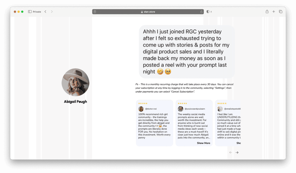
As an entrepreneur, you can use social proof to pitch your offer, boost authority, and instill trust—while reducing perceived risk and removing hesitation.
And it doesn’t have to be complicated. You can build trust in your offer by:
- Adding testimonials, like short quotes, ratings, or videos from customers who have seen results
- Including visuals of before-and-after outcomes, like screenshots of their performance or photos of specific wins
If you’re just starting out and can’t rely on customer testimonials, you can use your own story or transformation to highlight specific proven outcomes. Instead of saying “This helped me a lot,” you can lead with something stronger, like, “I used this system and sold my first 10 digital downloads in 3 days.”
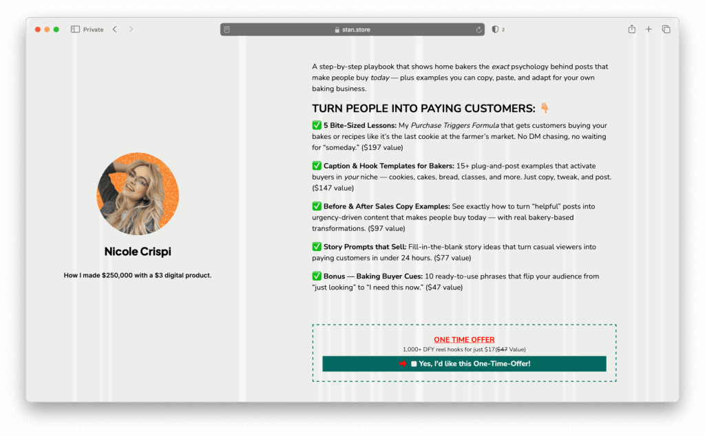
6. Present an Irresistible Offer
Your product may be packed with value, but how you frame it will determine how people perceive that value. An irresistible offer makes the price feel like a no-brainer.
Here are a few strategies you can use to boost value perceptions:
- Break it into parts so it feels more robust. Instead of saying “Course + workbook,” list it out as “6-Module Video Course + Printable Workbook + Private Community.” Suddenly, your offer comes across as a complete package instead of just one item
- Add bonuses that remove roadblocks. Think about what usually stops someone from taking action or getting the most out of your offer, and solve it for them. For example, if your main offer is a content strategy course, you could include “Bonus: 30 Days of Plug-and-Play Content Templates so you can start posting right away without staring at a blank page”
- Use value stacking to shift perceptions. Show buyers exactly what they’re getting versus what they’re paying. For example:
- Blueprint Training ($99 value)
- Swipe Files ($29 value)
- Templates ($49 value)
- Total Value: $177 → Your Price: $49
7. Seal the Deal with a Strong Call-to-Action (CTA)
Even the best offer won’t convert without a clear, compelling CTA. This is the final nudge that turns interest into action.
Strengthen your CTAs by:
- Keeping CTA buttons short, specific, and action-oriented, like “Start My Blueprint” or “Get Instant Access”
- Repeating your CTA throughout the page—including at least at the top, middle, and bottom of the page
- Using urgency drivers to get them to “Buy now!” such as time-bound discounts, limited bonuses, or “don’t miss out” language
Common Sales Page Mistakes to Avoid
Even the best Creators can slip up on sales pages. Watch out for these common mistakes so you don’t sabotage your conversions:
- Leading with features instead of outcomes. Listing what’s inside your product without showing the transformation can leave your audience guessing why they need it
- Hiding the price until the end. It creates friction and feels like a bait-and-switch. Be upfront and use the rest of your page to highlight your offer’s value
- Overloading with text. Walls of copy can overwhelm readers. And with increasingly shorter attention spans, less is more—so use clear headers, bullets, and visuals
- Not optimizing for mobile. More than half your audience will view your sales page on their phone (especially if you’re a social-first Creator!) If your sales page looks clunky on mobile or is impossible to navigate, you’ll lose them instantly
Steal These Strategies: Your Sales Page Checklist
Ready to boost your Creator business with a sales page that converts? Use this checklist to make sure you’ve covered all your bases.
☑️ Headlines that hook → Does your headline clearly promise a specific outcome in 12 words or less? Rewrite until it makes you want to click.
☑️ Objections crushed → Have you addressed at least 3 common hesitations (price, results, difficulty, trust) in an FAQ or inline copy?
☑️ Clear transformation → Can a stranger read your page and instantly see the before → after journey your offer delivers?
☑️ Emotional connection → Does your copy make the reader feel seen by naming their pain points in their own language?
☑️ Proof stacked → Do you have at least 2 forms of social proof (testimonial, screenshot, personal story) that reassure buyers they’re not taking a risk?
☑️ Offer stacked with bonuses → Have you broken down what’s inside and added at least one bonus that removes a common roadblock?
☑️ Pricing framed smartly → Is your price shown against the full value (anchored higher) so it feels like a no-brainer?
☑️ Urgency added → Is there a reason to buy now (discount, bonus expiring, limited spots) clearly communicated?
☑️ CTAs repeated and obvious → Is your main CTA repeated at least 3 times (top, middle, bottom), always clear and action-oriented?
☑️ Mobile check → Did you preview your page on your phone to confirm it’s scannable, loads quickly, and feels emotionally engaging?
Bringing It All Together
The truth is, sales pages don’t have to be overwhelmed with information and a long-scroll page experience to be effective. With a few intentional shifts, you can build one that does the heavy lifting for you so you can spend less time selling and more time creating.
I’ve seen Creators at every stage—from their very first digital product to six-figure launches—get results from these exact principles. And I know you can, too.
FAQ: Sales Pages for Creators
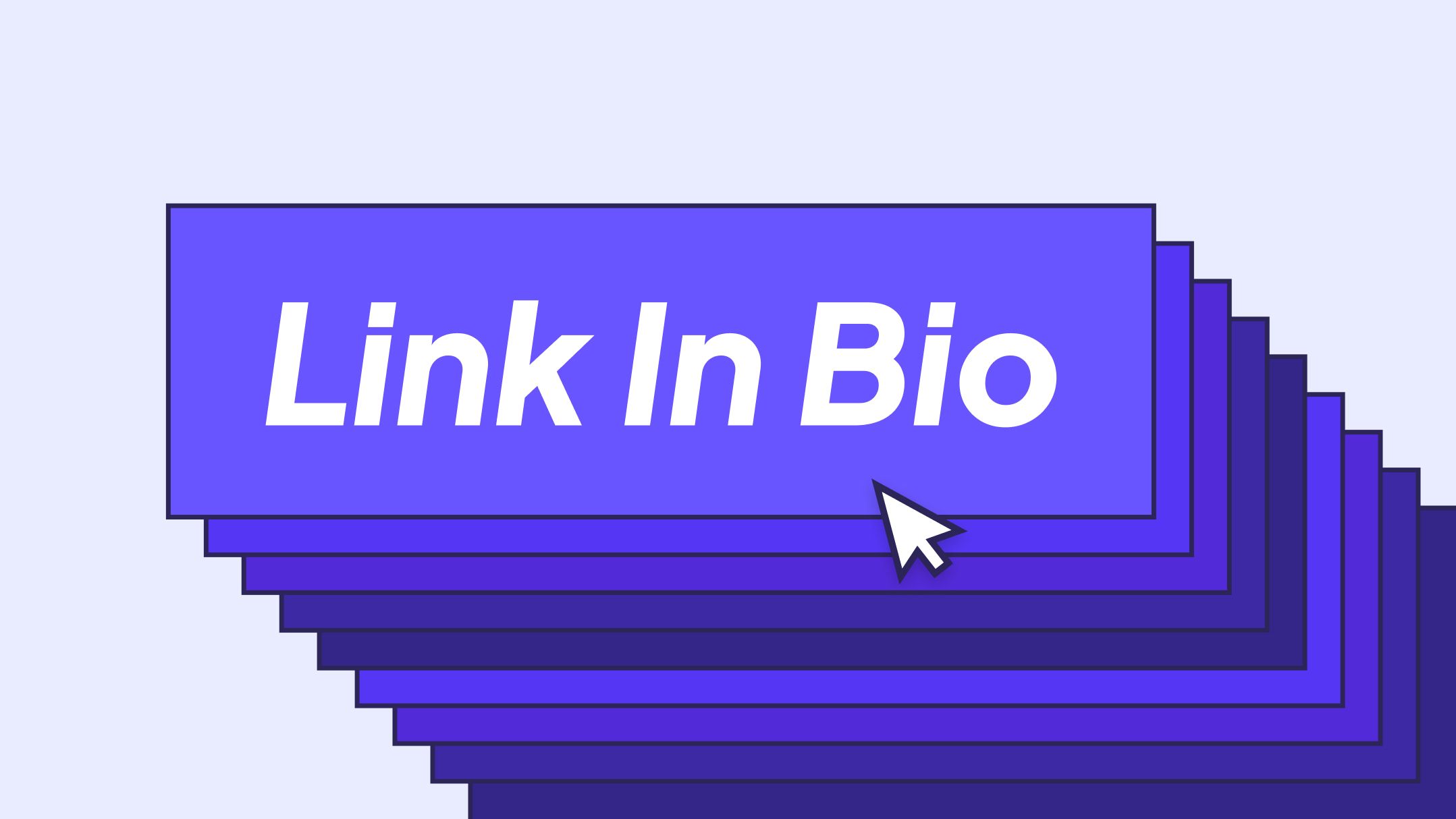
1. Do I really need a sales page if I’m already selling through my link in bio?
Yes! Your link in bio is like the front door, but your sales page can help convince someone to go deeper and make a purchase. A checkout link might work for quick, low-cost purchases, but a sales page gives you space to explain value, answer hesitations, and build trust—turning a “maybe later” into “buy now.”
2. How long should my sales page be?
There’s no magic word count—it’s about covering what your audience needs to feel confident buying. Some offers convert with a short, punchy page. Others need more detail, testimonials, and examples. The higher the price or the newer your audience is to you, the more detail you’ll usually need.
3. What if I don’t have any testimonials yet?
No problem. Share your own transformation or results—people connect with real stories. You can also use mini case studies, screenshots, or even explain the methodology behind your product or approach. And as soon as you start getting customers, make an effort to capture their wins and feedback so you can add them to your sales page.
4. How many CTAs should I add?
At least three—top, middle, and bottom of the page. Don’t assume people will scroll all the way down. Give them a chance to buy whenever they’re ready.
5. Can I create a sales page with Stan?
Absolutely. With Stan, every product in your store includes a sales page automatically—digital products, coaching, memberships, and more (the only exceptions are lead magnets and external links/URLs).